Tutorial: Graph time
Graph time is the length of the time used to display candlesticks or OHLC bars on historical graphs. Most commonly, daily data is used (i.e. the daily Open, High, Low and Close) but you may wish to change this either to remove daily volatility from your charts, or simply to make the charts more readable. The main settings used are Dynamic, Daily, Weekly and Monthly.
Let's have a look at this in more detail; but first let's make sure we are using bars or candles on the Historical Graph by pressing the Display OHLC bars button ![]() or the Display candlesticks button
or the Display candlesticks button ![]() . If you do not have these buttons on your Graph toolbar, right click in the graph and select Graph Design. On the Price tab select OHLC bars or Candlestick.
. If you do not have these buttons on your Graph toolbar, right click in the graph and select Graph Design. On the Price tab select OHLC bars or Candlestick.
Dynamic graph time
By default the Historical Graphs are set to use a Dynamic selection of scale. You will know if this is selected on your graph by looking in the top left corner to see if it says (dyn.):

With this option selected, whenever you zoom in or out on the graph, the amount of data used to draw each bar or candle will change dynamically to best fit the data onto the graph. Remember, to zoom in, left click and drag over a section of the graph to select it. To zoom out to the full history, double left click in the graph. The more history you are viewing, the more days, weeks or months are used for each bar or candlestick.
A graph displaying the full history of the share may use bars of many weeks or months:

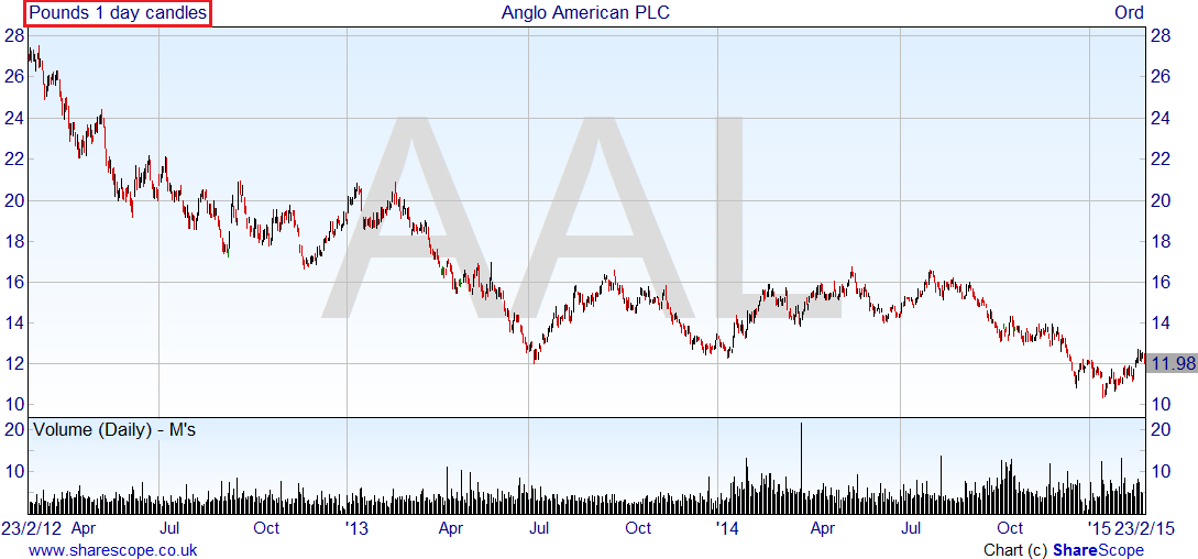
A graph only showing a few months of data may use daily bars or candles instead:

Instead of trying to zoom in to get daily or weekly bars on the graph, you can set the time periods used. This means that regardless of the range of data you are seeing on the graph, you will always use the graph time period selected (i.e. Daily, Weekly or Monthly). This applies to the current Graph Setting only.
Daily graph time

To set the graph to always show daily bars, press the Bar time toolbar button, and click on Daily bars. If you don't have this, go into the Graph Design dialog, then to the Time tab and select 1 day, or use the keyboard shortcut of Ctrl+1.
You will notice that the (dyn.) is removed, and regardless of whether you are looking at the full history of the graph, or if you are zoomed into a shorter time frame, the graph will always show you 1 day bars/candles.
Weekly/Monthly graph time
To change to one week bars/candles, press the Bar Time toolbar button on the toolbar and click on Weekly bars or Ctrl+5 on your keyboard (we use '5' for five trading days). Zoom in and out on the graph to see that this remains as the selected graph time.
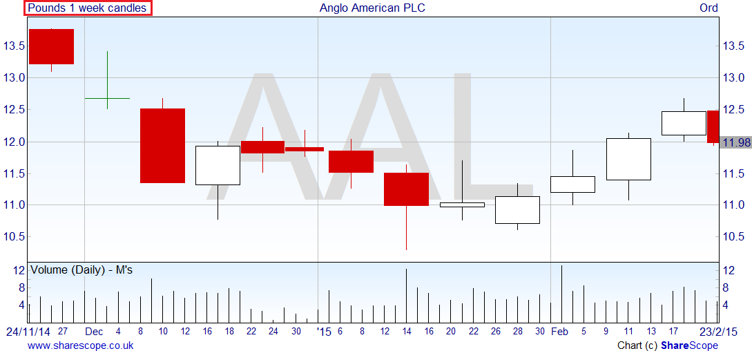
Weekly bars/candles will always use Monday's Open price as the Open and Friday's Close as the Close - if there is a Bank Holiday then that day is omitted from the week and the Weekly bar/candle will only use 4 days of data (or 3 over Christmas).
To change to one month bars/candles, press the Bar Time button on the toolbar. There is no keyboard shortcut set up by default for this - however you can set one up yourself. See Tutorial 11 - Toolbars and Keyboard Shortcuts for more information on setting up keyboard shortcuts. If you don't have the button though (Tutorial 11 will also show you how to add/remove toolbar buttons) you can select 1 month on the Time tab in the Graph Design dialog.
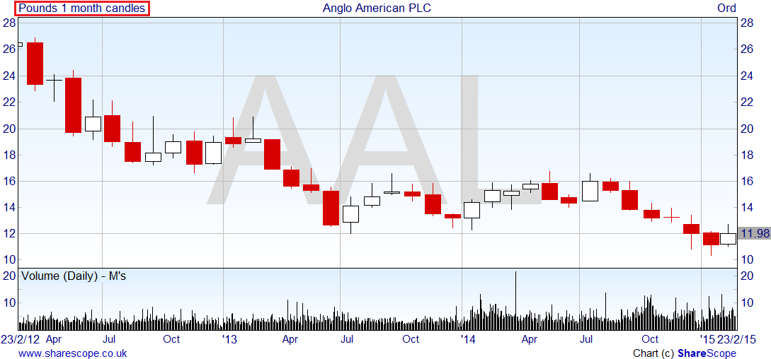
For Monthly bars/candles the Open is the Open on the 1st trading day of the month, and the Close is the Close on the last trading day of the month.
The other options available are 2 to 5 day bars, and 2 to 4 week bars and are available from the toolbar button:

5 day bars differ from weekly bars; each 5 day bar will always be constructed from 5 days worth of data whereas weekly bars will be constructed from fewer than 5 days worth of data in the event of bank holidays falling within the week.
Graph time and Analytics
Besides using different graph times to change the amount of data used in drawing bars and candles, the graph time can also be used when adding analytics such as Moving Averages or indicators like MACD to the graphs.
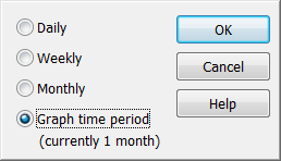
When you add an indicator you should see the following option in the indicator dialog:
By default, all analytics and indicators are calculated using the graph time period. Click on the Graph time period button to view your other options:
The Daily, Weekly and Monthly options will always use this as the Data source, regardless of the time periods used on the graph. The Graph time period option also works with the Dynamic selection of scale time period - so as the graph time changes depending on the amount of data displayed on the graph, so the indicators and analytics will change how they are calculated.
Selecting Graph time period and adding an MACD indicator to the graph, the indicator title tells you the period being used in its calculation:

The Bars advises us that it is using the same period as the graph (in this example, 1 month candles).
The example below is using weekly data on the same graph, look at the indicator title for confirmation:

Remember, if you have any trouble finding or using any of these features, please don't hesitate to contact our Customer Support team. They will be delighted to help.