Tutorial: Zooming in on ShareScope charts
This tutorial focuses on the different ways of limiting the date range in the graph screen.
In this tutorial:
Limit Date Range
One of the more precise methods of specifying a date range on the graph screen is by using the Limit Date Range function.
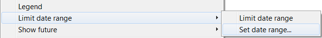
To access this option, right-click in the middle of the graph screen and select Limit Date Range from the context menu. From the sub-menu, click on Set Date Range...
From this dialog, you can select to view either a defined number of days, weeks, months or years and/or enter specific start and end dates.

When selecting a specific start or end date, you can enter the date parameters in one of three ways:
- Type a date into the date box
- Hover the cursor over the date which appears under the date box, and use the arrows to move the date backwards/forwards.
- Click on the
 button to the right of the date box to select from a calendar.
Once you have made your selection, click OK.
To toggle between your chosen limited range and the full data range available, double-click in the middle of the graph screen.
To permanently turn-off the Limit Date Range setting, right-click in the middle of the screen, and de-select Limit Date Range on the context menu.
Note: you are limiting the date range for the current Graph Setting; all graphs using that Graph Setting will be affected.
Click and drag functionality
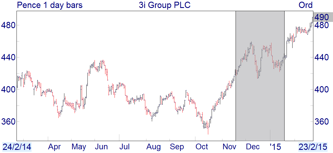
You can zoom in on a particular area of a graph by clicking and dragging over the area you want to see in more detail. This is a great way to temporarily look at different parts of the graph.
As you drag the mouse, you will notice that the selected area will be highlighted in a grey colour, as illustrated below. Once you are happy with your selection, release the mouse button to zoom in on the area of interest.
Once zoomed in, you can scroll the graph left/right using the left/right arrow keys on your keyboard.
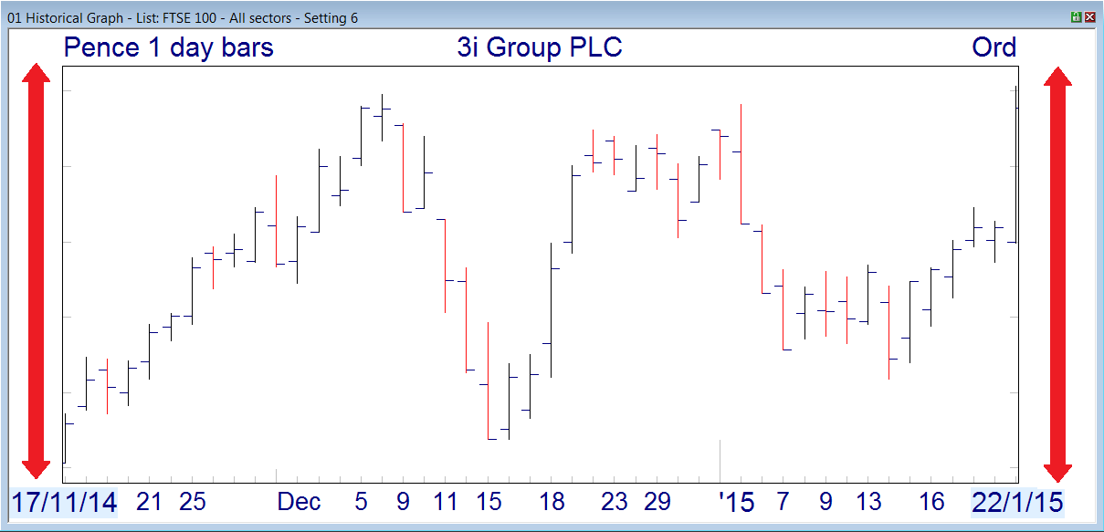
If you limit the date range too much, you can click on the vertical scale to the left or right of graph to expand in that direction. This area is highlighted by the red arrows in the image below:
To return the graph to its original size, double-click in the middle of the screen.
Timescale scroll bar (historical graphs only)
The Timescale scroll bar is a multi-functional tool that allows you to zoom in and out of a price chart and, once zoomed in, scroll through the price history of a given stock.
To add the Timescale scroll bar, right-click on the middle of the graph screen and select Graph Design... from the context menu. In the dialog that appears, click on the Time tab and tick the Add timescale scroll bar option. Click OK.

You will notice that a scrollbar now appears just below the main graph screen.

There are two sets of arrows at each end of the scroll bar.

Outer arrows: these allow you to scroll through the time period in either direction. Click on the right arrow to scroll to more recent data, or click on the left arrow to see older data.
Note that if you are already viewing the entire price history (i.e. the scroll bar is set to its full width), you will not be able to move left or right.
Inner arrows: the inner arrows allow you to extend or reduce the time period displayed on the graph.
To illustrate, let's look at the following example:
The graph below shows a price chart showing two years' data from 2nd January 2013. To reduce the time frame, click and drag the left inner arrow to make the bar narrower. You will notice that the arrows on the inner bar turn red. This changes the start date but not the end date. As you can see, the more you decrease the width of the scroll bar, the more you are able to zoom in.

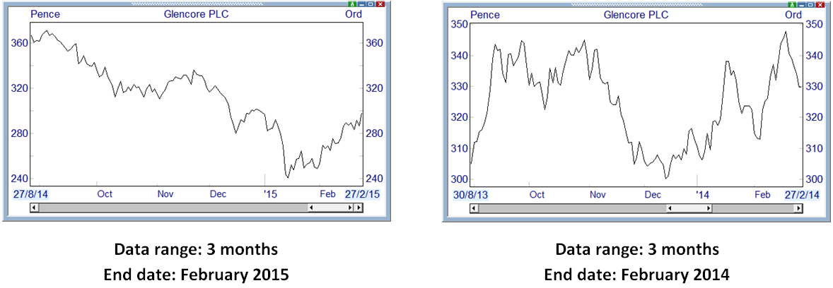
You can click and drag the scroll bar (not the arrows) to scan through the price history of the stock. Notice how this maintains the same data parameters (in this case 3 months) as you move backwards and forwards.
To zoom in with increase accuracy, you can choose to display a double height timescale which will display days/months on a separate line to the year for increased clarity.

To add this feature, right-click on the middle of the graph screen and select Graph Design... from the context menu. In the dialog that appears, click on the Time tab and tick the Draw double height timescale option. Click OK.


Keyboard shortcuts (historical graphs only)
As an alternative to the above toolbar buttons, you can use keyboard shortcuts to change the range on a graph.
Again there are six available options and the default keyboard settings are as follows:
| Shift + 1 | Limit date range of display to 1 month |
|---|---|
| Shift + 2 | Limit date range of display to 3 months |
| Shift + 3 | Limit date range of display to 6 months |
| Shift + 4 | Limit date range of display to 1 year |
| Shift + 5 | Limit date range of display to 2 years |
| Shift + 6 | Limit date range of display to 5 years |
Note: when using the toolbar buttons or the keyboard, the date range will be limited to the period ending at whatever date is shown at the bottom right of the graph.
Remember, if you have any trouble finding or using any of these features, please don't hesitate to contact our Customer Support team. They will be delighted to help.