Tutorial: The Portfolio Valuation Chart
The portfolio valuation chart can be viewed at the top of each of the four different transaction views:
The Portfolio Valuation Chart is accessible via the Chart button, located between the Current holdings and Sharing buttons, as shown below:
This can be toggled on (dark green) or off (light screen) on a per view basis - so for example, it can displayed whilst in the Holdings view, but deactivated in the other three views.
The Portfolio Valuation Chart is equipped with a number of customisable features which can be best categorised as follows:
Changing the date range
A Range button beneath the chart allows you to view various time frames for your portfolio:
- 1 day ago
- 1 week ago
- 1 month ago
- 1 year ago
- Year to date
- Previous year
- Tax year to date
- Previous tax year
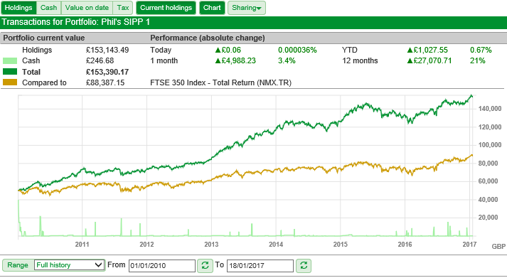
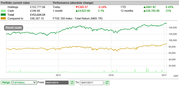
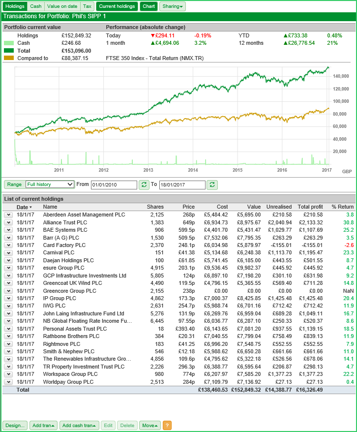
- Full History
There are two ways of viewing a date range not listed in the Range drop-down menu:
- Use your mouse to click and drag over a particular range (or use your finger if using a touch-screen). The selected area will be shaded in grey,
and releasing your mouse/finger will zoom accordingly.
- If you prefer to be a little more precise, then you can enter the dates manually using the From and To date fields. Once you have entered the new dates, simply press the green refresh button
 to the right of the date field.
Once you have zoomed in on the chart you will see one or both of the dates shaded in grey to indicate they have been changed. A Reset zoom button also appears at the top left-hand corner of the chart. You can use this to reset the chart back to whatever selection you had prevously set for the date range.
Changing the display
At the bottom-left of the Transaction screen is a pale green Design button. This can be used to customise which metrics are shown on the chart and in which colour.
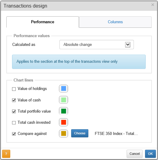
Value of holdings and Value of cash fluctuate as you buy and sell shares. When you buy a share your cash will go down by the same amount your holdings goes up and vice versa.
The portfolio value combines the value of your holdings and the value of your cash and is the main line usually drawn on the chart.
The cash invested line shows how much cash you have credited to, and debited from, the portfolio.
You can set the Compare against line to any instrument available in the database. In the case, the FTSE 350 Total Return index has been chosen.
The colour of each of the lines can be set using the square colour pickers.
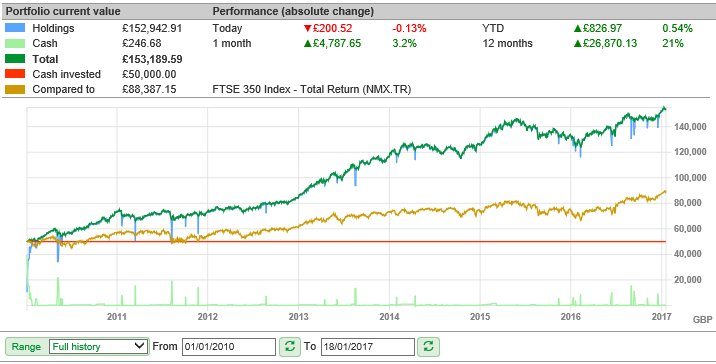
This is how the chart looks with all of the options turned on.
The cash line at the bottom of the screen peaks up as shares are being sold and the holdings line drops downwards at the same time (pale green and pale blue lines).
The portfolio is kept fully invested so the amount cash available for the most part is fractional when compared to the total portfolio value.
The chart also shows that this portfolio is based on an initial investment of £50,000 and that no other credits or debits have been recorded since the initial investment date (red line).